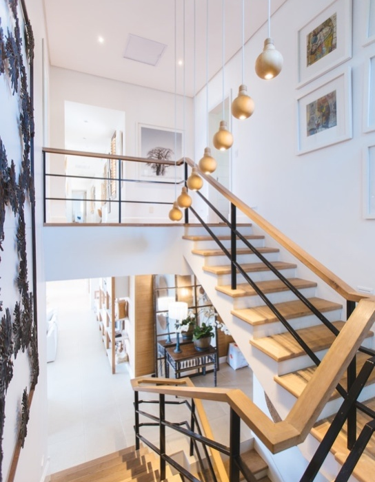
Selling Sunset is a show depicting the lives of real estate agents catering to high-end buyers, selling them everything but the sunset. While you may watch the show for the tea, we do it for the interior design elements in every episode that inspire those at MLL Custom.
Here are the most important design lessons from the ongoing series.
1. Neutral Doesn’t Mean Vanilla
Neutrals would always be relevant because we don’t have an alternate for colors that gives a space a sophisticated yet calming air. These colors appeal to the buyers, and they sure called to us during the show, where the set designers decided to have neutrals across homes for sale and otherwise.
Another thing they did was reinforce the idea that neutrals don’t have to be boring. They did this by foregrounding the neutrals with vibrant colors and alternating them with a patterned wallpaper here and the odd artwork there.
2. Keep Your Artwork Bold Yet Personal
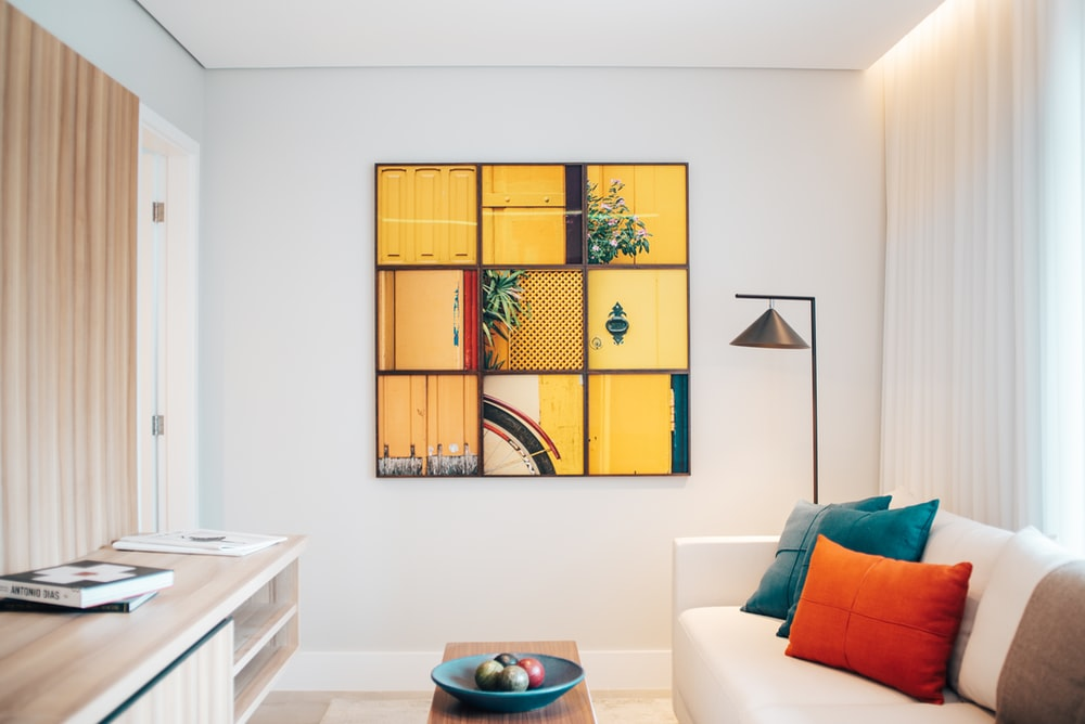
Most real estate agents use artwork when staging homes, and the ones on Selling Sunset are no exception. If you’ve watched the show, you’ve probably seen the episode where Heather gets sources several big and bold pieces from a gallery to prepare the home for a viewing. She might’ve been right on the bold front, but she was wrong to assume the pieces would appeal to potential buyers on that feature alone.
Although large and vibrant artwork draws attention, it doesn’t get many takers unless it means something to them. Thus, you must call the shots on the kind of artwork you want. Keep it bright and go big, but don’t go for something that flies right over your head.
3. Open Floors Call for Better Kitchens
There’ve been more than a few open floor plans on Selling Sunset. It may have crossed your vision but never grabbed your attention. Rectify this when rewatching the show, this time for the design elements in the background.
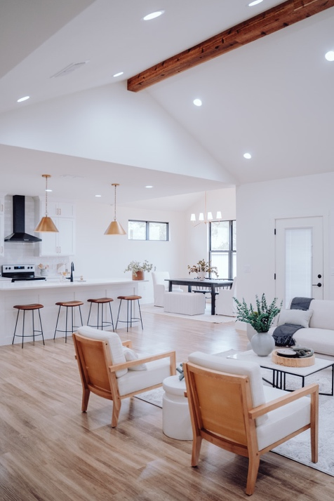
As far as open floors are concerned, you’ll notice that they all have kitchens with islands to accommodate more people. You’ll even see Heather alluding to making it the highlight of one such home interior.
Take a page out of that book by making your kitchen the heart of your open floor. Take us literally by placing it right in the center, but it’ll shine just as bright in a corner as long as it’s got the hallmarks of a contemporary kitchen.
4. A Simple Interior is a Universally Appealing Interior
The series at the center of our blog today might have some flair, but that’s because it’s a show airing on a streaming site. It needs to keep people’s attention with the background when the unfolding story assumes a steadier pace.
Having said that, it’s not the bolder designs that have appealed to us on the show but their simpler counterparts. Sticking to safe and classical designs means avoiding polarizing reactions. It brings people on the same page, which even this show has indirectly alluded to on multiple occasions.
Let Us Sell You an Interior Design Service in Sherman Oaks
Are you feeling inspired by the above inspirations from Selling Sunset? Reset your home, not the sun, with our home interior remodeling services. Share the purpose of your home renovation, invite our design team to your home for a tour, and learn how you can change your interior outlook with kitchen cabinets, custom closets, bathroom vanities, and more.
Reach out to request our home interior design services in Sherman Oaks.
